Updated Date: 07/07/2026
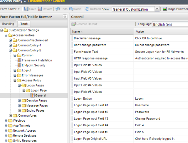
General Customization
The table lists settings for customizing general page style in the General Customization view. Style sheet (CSS) settings are available for customization in the Advanced Customization view.
| Name | Description |
|---|---|
| Page alignment | Alignment of the contents against the body if the width of the contents (Page width) is less than 100%. |
| Page background color | Background color of the page; corresponds to CSS body { background-color: #**XXXXX** }. |
| Page width (px or %) | Width of the header, footer, and contents tables. |
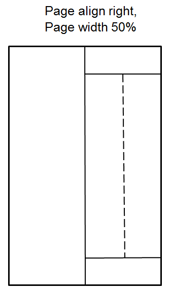
The figure shows the result of setting page alignment to right and page width to 50% in the general page style settings for an access profile.
The table lists font settings for general page style customization. The style sheet (CSS) settings that are mentioned are available for customization in the Advanced Customization view.
| Name | Description |
|---|---|
| Font family (comma-separated) | Font used on page; corresponds to CSS * { font-family:… } |
| Headline font size (px) | Corresponds to CSS font-size of headlines |
| Text font size (px) | Corresponds to CSS font-size of all other (non-headline) elements |
The table lists settings for customizing page layouts from the general customization view. Style sheet (CSS) settings are available for customization in the Advanced Customization view.
| Name | Description |
|---|---|
| Form cell width (px or %) | Maximum width of the form cell. |
| Image cell width (px or %) | Maximum width of the image cell, or empty area if no image is provided. This setting has no effect if Page layout is set to Form Center. |
| Main table background color | Background color of the contents table. Overrides Page background color in General Page Style Settings. Corresponds to CSS table#main_table { table_background_color: #**XXXXXX** } . |
| Page layout | Location of the form cell: left, right, or center. When set to Form Left or Form Right and an image is specified, it displays opposite the form. When set to Form Center, whether an image is specified or not, no image displays. (Access policy items that support images are affected, including logon page, decision box, and message box.) |
This figure shows the proportions of a page with these page layout settings:
- Page layout - Form left
- Image cell width - 50%
- Form cell width - 50%
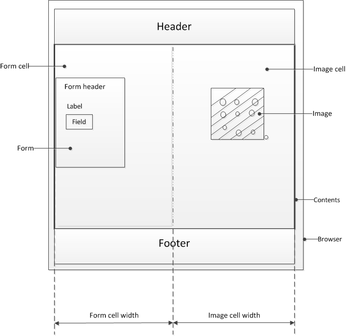
The form cell is on the left. The image cell is opposite the form cell. The form cell and the image cell each fill 50% of the width of the content area.
The table lists settings for customizing the page header style from the general customization view. Style sheet (CSS) settings are available for customization in the Advanced Customization view.
| Name | Description |
|---|---|
| Disconnect icon | Image for disconnect button, 48 x 48 pixels or smaller. |
| Header background color | Corresponds to CSS table#page_header { background-color: #**XXXXXX** }. |
| Header left image (Full Size) | Corporate logo image, 80 x 80 pixels or smaller. |
| Header left image (Mobile Devices Size) | Corporate logo image, 32 x 32 pixels or smaller. |
You can customize the following settings for the page footer style with the Customization tool. Style sheet (CSS) settings are available for customization in the Advanced Customization view.
| Name | Description |
|---|---|
| Footer font size (px) | Corresponds to CSS table#page_footer { font-size: …. } |
You can customize the following settings for the main page image with the Customization tool.
| Name | Description |
|---|---|
| Default image | Image to display in the image cell. |
| Image left margin (px) | Left margin of the image. |
| Image right margin (px) | Right margin of the image. |
| Image top margin (px) | Top margin of the image. |
| Side image alignment | Horizontal alignment of the image within the image cell. |
You can customize the following settings for the login form with the Customization tool. Style sheet (CSS) settings are available for customization in the Advanced Customization view.
| Name | Description |
|---|---|
| Form alignment | Alignment of the form within the form cell. |
| Form background color | Background color for the form. Corresponds to CSS table#main_table table#credentials_table{ background-color: %[form_background_color] } |
| Form height (px, %, or auto) | Specifies the height of the form; when specified as %, it is a percentage of the height of the form cell. |
| Form left margin (px) | Left margin of the form. |
| Form right margin (px) | Right margin of the form. |
| Form top margin (px) | Top margin of the login form. |
| Form width (px or %) | Specifies width of the form width; when specified as %, it is a percentage of the width of the form cell. |
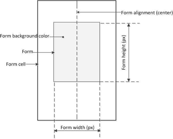
This figure illustrates a form and its settings within a form cell.
You can customize the appearance of elements in the logon form using these settings in the General Customization view.
| Name | Description |
|---|---|
| Field alignment | Alignment of the fields against the form. |
| Field width (%) | Width of the input, password, and select fields as a percentage of the form width. |
| Header alignment | Alignment of the header in the form. |
| Label alignment | Alignment of labels to the corresponding input fields. |
| Label position | Position of field labels: above or to the left of their respective fields. |
| Label width (%) | Specifies a uniform width for field labels as a percentage of the form width. |
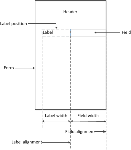
This figure illustrates the elements in a form configured with these setting values.
- Header alignment: center
- Label alignment: right
- Label width: 40%
- Label position: left
- Field alignment: right
- Field width: 50%
You set advanced customization images to make images you add through the image browser available to your advanced customization pages.
The Advanced Customization Images properties pages allow you to set advanced customization images from the image browser to associate with advanced customization image names. You can then use the image name to add an image to an advanced customization page.
To select an image from the image browser to associate with an image for advanced customization, click the button next to the current (or default) image name, and select Replace.
Logon page customization depends to some extent on the logon page properties that are configured in the visual policy editor. Logon page properties include five fields that can be configured to accept some type of input or not (when the input type is set to none). Any field that does not accept input is hidden from the user at logon; however, it is not hidden in the customization user interface.
General customization for a logon page supports changing:
- The text on the screen, including the prompts for input fields.
- The image to display.
Note: These properties can also be updated from the visual policy editor. The same file is updated whether personalizing the logon page from general customization or the visual policy editor.
The type of input that a logon page field accepts can only be specified in the visual policy editor. If the type is none, the field cannot be customized in the visual policy editor and, at logon, it is hidden from the user. However, all five fields are always available for customization from the General Customization view.
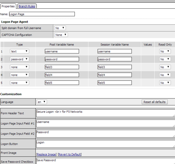
You can customize the following settings for logon pages that appear in web browsers and on mobile devices with the Customization tool.
|
Name |
Description |
|---|---|
|
Front Image |
Customization |
|
Form Header Text |
Text that displays above the form. |
|
Input Field #n Values |
Localized text for any input field (number 1 to 5) of type select or radio. (Input types are specified in the visual policy editor), Values and text are defined in this format “value1=>text1;value2=>text2”, and so on. For example: server1=>Corporate;server2=>Finance;server3=>Sales The values and text must be defined in the visual policy editor for the field before you can customize the text.Note: From the customization interface, personalize the text fields (Corporate, Finance, Sales) only. |
|
Logon Page Input Field # (1-5) |
Text that is displayed on the logon page for each of the logon page agents, defined in the Logon Page Agent screen area. |
|
Logon Button |
Caption of form submit button. |
|
New Password Prompt |
Text displayed when requesting a new Active Directory password. |
|
Password and Password Verification do not Match |
Error message displayed for password entries that do not match one another. |
|
Save Password Checkbox |
Text displayed adjacent to the check box that allows users to save their passwords in the logon form. This field is used only in the secure access client, and not in the web client. |
|
Verify Password Prompt |
Text displayed next to password confirmation field when a new Active Directory password is requested. |
Mobile browsers and full browsers share the same UI page template HTML, but use different CSS files to optimize presentation for the type of device. To tune the mobile browser CSS, you must edit CSS files using the Advanced Customization view.