Updated Date: 07/07/2026
Statistics Monitoring Overview
You can use the statistics collected by F5 BIG-IQ Centralized Management to visually analyze the performance of the traffic, services, and devices of your managed BIG-IP systems. The statistics are displayed in graphical charts and tables that you can drill down into for more specific details that pertain to a host device, traffic aspect, configured service, or network setting. You can focus the statistics in the charts on different categories such as virtual servers, pools, pool members, or DNS traffic.
You can monitor statistics data provided by the BIG-IP devices managed by BIG-IQ Centralize Management. There are a few things you need to do before you can start monitoring the statistics data generated by your managed devices.
- You must have AVR provisioned on your BIG-IP devices in order to collect statistics.
- You need to install, configure, and discover a data collection device (DCD). The DCD stores the data from your devices, and routes the date to your BIG-IQ device. Refer to Planning and Implementing a Centralized Management Deployment for details.
- You need to enable statistics collection for the devices you want to monitor. There a couple of ways to do that. Refer to Enabling Statistics Collection for details.
Once you have your system set up and you are receiving statistics, you should take a minute or two to understand how the user interface works. The interface is set up so that statistics from Device, DNS, Local Traffic, Network Security, and Web Application Security use a common set of tools to manage how you access and manage your data. Once you understand how this common interface works, you should be ready to go.
Important: Statistics for the Access component use a slightly different user interface. For details on monitoring these statistics, refer to Access Reporting and Statistics.
Important: Statistics for this BIG-IQ device also use a different user interface. For details on monitoring these statistics, go to System > THIS DEVICE > Statistics, or System > THIS DEVICE > BIG-IQ Metrics and refer to the online help.
This figure shows a typical statistics overview screen. The three parts of the statistics overview screens work together so you can fine-tune the statistics display. To view a screen similar to this, click Monitoring > DASHBOARDS > Device > Health. You must configure statistics collection in order to view data.
Note: The Overview screen for DNS has a few extra controls. For details, see What is different about the DNS Overview screen?.
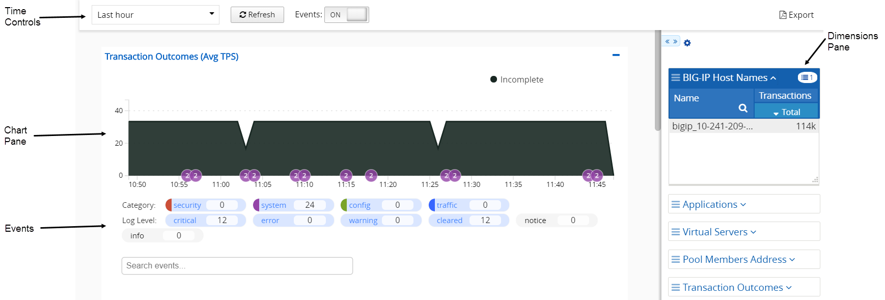
The table defines key elements of this screen.
| User interface area | What does this part of the screen do? |
|---|---|
| Time Controls | Adjusts the time window for which statistics are displayed. For details on how these controls work, see How do the time controls work?. |
| Events and Traffic Capturing | Controls the display of additional data pertaining to traffic patterns detected over time. The Traffic Capturing control is limited to screens that display HTTP traffic information. For details on how these controls work, seeHow do events and traffic capturing controls work? |
| Chart Pane | Displays a series of charts that plot the collected statistics. For details on how to manipulate these charts, see How does the chart pane work?. |
| Dimensions Pane | Determines the objects for which you display statistics. For details on how the controls on this pane work, see How does the dimensions pane work?. |
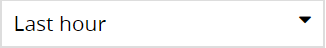
This figure shows a close up of the time controls on a typical overview screen. To view a screen similar to this, click Monitoring > DASHBOARDS > Device > Health.The time controls work together to give you control of the specific time period for which you wan to see statistics.
Key elements of this screen are defined in the table:
|
User interface control |
User interface display |
What does this control do? |
|---|---|---|
|
Time Selector |
|
Use this control to specify the length of time for which you want to view statistics data. Time selection options become available as your system gathers data, over time. Data is displayed from the instant the last refresh occurred, back to time interval you specify. For example, if the last refresh occurred at 11:00, and the Time Selector is set to 30 minutes, the charts display data from 10:30 to 11:00. |
|
Custom Time Range |
|
Use this control to focus on a specific date and time to display data. Tip: Alternatively, you can click on the chart axis to specify the focus. Click on a point in the axis and drag in the direction that you want to view. As you drag, a highlighted window shows what you have selected for the time selector focus, and a small magnifying glass icon appears. When you have the time selector focus you want, click the magnifying glass. |
|
Refresh Interval |

|
Use this control to specify how frequently the data on this page is refreshed. Click the icon to trigger an immediate refresh of the data on the screen. |
|
Events and Traffic Capturing |
|
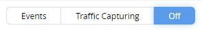
Use this control to display additional traffic information over the charts. By selecting these, you can identify aspects of traffic that caused a change in data or performance.Note: Traffic Capturing is limited to screens that display HTTP data. |
|
Export |
|
Use this control to export chart data to a printable source. Once you click the control you can select whether to export all data, or only data pertaining to the selected dimension filters. |
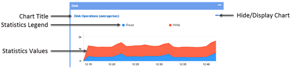
This figure shows a closer look at the elements that make up the chart pane on a typical Overview screen. To view a screen similar to this, click Monitoring > DASHBOARDS > Device > Health. You can re-order the charts by dragging and dropping them into place.
Key elements of this screen are defined in the table.
|
User interface control |
What does this control do? |
|---|---|
|
Chart Title |
Each chart displays a title that identifies the statistic that plots on that chart. Each title includes the units of measure that apply to these plots. |
|
Statistics Legend |
These colored dots identify the specific plots displayed on the chart. When you move your cursor over a chart, the value of each plot displays adjacent to these dots. If there is a multiplier applied to a value, it displays as well. For example, if you hover over one of the New Connections plots and the value |
|
Statistics Values |
These plots display the value of the statistics collected for the selected time period. Data is aggregated for the objects or devices that are currently selected. Initially, the selection is all of the managed objects or devices, but you can use the dimensions pane to change the selection. If you select one device, the charts shows statistics for just that device. If you select two devices, the charts plot aggregated statistics for those devices. If you then select just one device, and five virtual servers, the charts plot aggregated statistics for the five virtual servers and the single device. For more information on using the dimensions pane refer to How does the dimensions pane work? |
|
Hide/Display Chart |
Use this control to hide or display a chart. When you hide a chart, the chart title remains. If you create a comparison chart, an additional control appears that you can use to delete that chart. |
In the BIG-IQ user interface, a dimension is a statistical category (for example BIG-IP host name or iRule event types). Each dimension is broken up into sub-categories that you can view when you expand the dimensions pane to display your statistical data as a table. The other primary use for the controls in the dimensions pane is to filter the objects for which statistics are displayed in the chart window. To view a screen similar to the following illustration, click Monitoring > DASHBOARDS > Device > Health, and then click the down arrow on the BIG-IP Host Names dimension. After you expand a dimension, you can select individual objects, or multiple objects, or create a comparison graph that displays statistics for selected objects. The figure shows the key elements that make up the dimensions pane on a typical Overview screen. You can re-order the dimensions by dragging and dropping them into place.
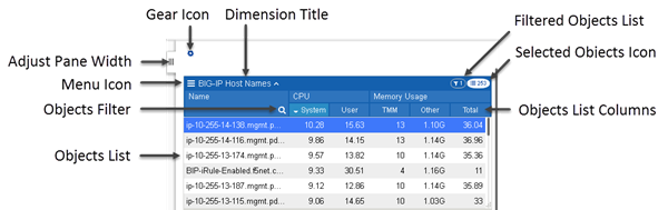
Key elements of this screen are defined in the table. Except for the name of each dimension and the pane width adjustment, these controls display only when you expand a dimension to display all of its members.
|
User interface control |
What does this control do? |
|---|---|
|
Adjust Pane Width |
With this tab, you can adjust the width of the chart and dimensions panes. To adjust the dimensions pane width, click this tab and drag the pane to the width you want. To extend the dimensions pane to full screen, single click this tab. |
|
Menu Icon |
When you click the menu icon, you can choose between several options that you can use to change what is displayed in the Dimensions pane.- Sort by lists the columns defined for the selected object. You can choose which column you want to sort the listed objects by.
Note: You can also sort a dimension or specify which columns display by right-clicking the column header. If you select one or more objects for a dimension, you can choose two additional options:- If you choose Add Comparison Chart, you can create a graph that plots values for two or more selected metrics. You can create multiple comparison charts and for each comparison chart, you change the metric that is being compared.
|
|
Objects Filter |
Click the magnifying glass to open a filter control. To filter the list of objects that display in the Objects List, type the name you want to find and click the magnifying glass again. Note that the filter is a prefix match (it starts with the first character of the object name), and the match is case-sensitive. |
|
Objects List |
The first 100 objects that meet the filter criteria display here. To display an object not in the top 100, you can change your filter criteria or sort order. Objects selected in the objects list, control the data that plots in the charts. That is:- When you select just one object, the data plotted on the charts is only for that object.
Note: If you select two or more objects in this list, you can create a comparison chart that plots values for a selected parameter. |
|
Objects List Columns |
The default number of columns that display depends on the type of dimension. You can also change which columns display using the menu icon. You can sort the entries in a dimension by clicking an individual column title. . |
|
Dimension Title |
The title of the dimension displays here adjacent to an up arrow/down arrow toggle. This toggle collapses and expands the list of objects of this dimension type for the devices you are currently managing. |
|
Gear Icon |
The gear icon provides several options that you can use to change how the objects you have selected in the Dimensions panel display.- You can use `` Clear Filtersto de-select all of the objects for the selected dimension.
|
|
Selected Objects Icon |
This icon displays the number of objects in this dimension that match the current filter settings. Note that the objects you select in one dimension impact the number of objects in the other dimensions. As an example, consider a BIG-IQ managing 20 BIG-IP devices that each have 100 virtual servers. Initially, on the Virtual Servers overview screen, the selected objects icon in the BIG-IP Host Names dimension reads 20, and the selected objects icon on the Virtual Servers dimension reads 2000. If you select one BIG-IP device, the icon for virtual servers changes to 100. On the other hand, if you select one of the virtual servers, the icon for BIG-IP devices would change to 1 (unless that virtual server happens to reside on more than one device). |
|
Filtered Objects Icon |
This icon displays the number of objects you have selected in this dimension. You can also click this icon to de-select all objects in this dimension. |
Comparison charts allow you to plot data values for selected items in a new chart. When you initially create a comparison chart, you select the statistical metric that you want to compare. When the comparison chart displays, the title for the new chart displays which items are selected for comparison, along with the metric being compared, followed by a down arrow icon. You can click that down arrow if you want to change the comparison metric for the selected objects. To compare additional items, you can create additional comparison charts by again selecting multiple items, right clicking and choosing Create Comparison Chart, and selecting the statistical metric you want to compare.
Once you enable Events in the time controls, you can find these events in the charts that display Device, Local Traffic and Web Application Security data ( Monitoring > DASHBOARDS), and in the charts that display specific application and BIG-IP device data ( Applications > APPLICATIONS or Applications > ENVIRONMENTS > Service Scaling Groups).
Events displayed in statistics charts provide you with insights about changes in application traffic or device resource data that might require attention or mitigation. An event includes any non-statistical measure that is reported by your BIG-IP device. Events usually indicate how the system was disrupted as a result of traffic changes, changes in system objects, or attacks. You can use events to identify if and when a specific occurrence affected an object’s performance.
This figure shows a close up of the event controls on a typical overview screen. To view a screen similar to this, click Monitoring > DASHBOARDS > Device > Health. The event controls allow you to: identify when a specific change in data occurred, filter events according to type (Category) or severity (Log Level), and view details of specific events.
The table defines key elements .
|
User interface control |
What does this control do? |
|---|---|
|
Event Indicator |
This control displays, below the chart area, the events table, which lists all events that occurred at a specific time. Click an event indicator to display the event table. The indicator number displays the number of detected events at that time. This number adjusts to reflect changes to the time focus. Events are color-coded according to their Category color. When more than one event category event occurs at a time, the indicator shape changes. You can view the event category breakdown by hovering the cursor over the indicator, as shown in the figure. |
|
Categories |
Use this control to filter the events displayed in the chart by category. Each category indicates the type of the reported event. Categories provide an organization structure that can indicate the nature or origin of each event. Each category is color-coded, and the number indicates the quantity of events from that category that are displayed in the chart. De-selecting a category (marked in gray) directly impacts the corresponding quantities in the log-levels and the events displayed in the chart. |
|
Log Levels |
Use this control to filter by log level the events that are displayed in the chart. Each log level indicates the severity of the reported event. Log levels indicate the severity of each event. Log levels are listed in descending order of severity, where Note: By default, notice and info log levels are not selected. |
|
Event Search |
Use this field to enter key words that filter the events displayed in the events table. |
|
Event Table |
Use the event table to review details of the events selected from the chart area. Click the table rows to view additional event details. |
This figure shows a typical DNS statistics overview screen. To view a screen similar to this, click Monitoring > DASHBOARDS > DNS > Overview. Until you configure statistics collection, there won’t be any data. You can use the time controls to focus on a time period of interest, similar to other overview screens. However, there are unique elements on this screen that provide you with a quick overview summarizing the DNS traffic performance on your managed devices.
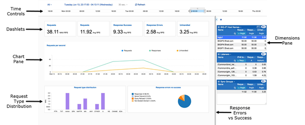
Key elements of this screen are defined in the table.
| User interface control | What does this part of the screen do? |
|---|---|
| Time Controls | Adjusts the time window for which statistics are displayed. For details on how these controls work, see How do the time controls work? |
| Dashlets | These small windows serve similarly to the gauges on a dashboard, providing a current performance readout for key performance statistics. |
| Chart Pane | Displays a series of charts that plot the collected statistics. For details on how to manipulate these charts, see How does the chart pane work? |
| Request Type Distribution | This chart graphs the types of request that are currently being processed by this DNS sync group. |
| Response Errors vs Success | This chart graphs the DNS sync group’s success rate in processing requests relative to the number of requests that result in errors. |
| Dimensions Pane | Determines the objects for which you display statistics. For details on how the controls on this pane work, see How does the dimensions pane work? |