Updated Date: 07/07/2026
How does the dimensions pane work?
In the BIG-IQ user interface, a dimension is a statistical category (for example BIG-IP host name or iRule event types). Each dimension is broken up into sub-categories that you can view when you expand the dimensions pane to display your statistical data as a table. The other primary use for the controls in the dimensions pane is to filter the objects for which statistics are displayed in the chart window. To view a screen similar to the following illustration, click Monitoring > DASHBOARDS > Device > Health, and then click the down arrow on the BIG-IP Host Names dimension. After you expand a dimension, you can select individual objects, or multiple objects, or create a comparison graph that displays statistics for selected objects. The figure shows the key elements that make up the dimensions pane on a typical Overview screen. You can re-order the dimensions by dragging and dropping them into place.
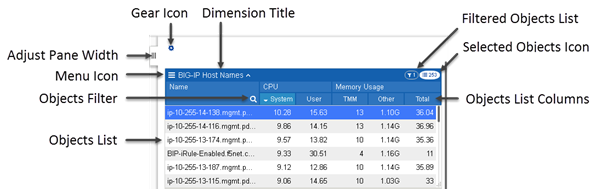
Key elements of this screen are defined in the table. Except for the name of each dimension and the pane width adjustment, these controls display only when you expand a dimension to display all of its members.
|
User interface control |
What does this control do? |
|---|---|
|
Adjust Pane Width |
With this tab, you can adjust the width of the chart and dimensions panes. To adjust the dimensions pane width, click this tab and drag the pane to the width you want. To extend the dimensions pane to full screen, single click this tab. |
|
Menu Icon |
When you click the menu icon, you can choose between several options that you can use to change what is displayed in the Dimensions pane.- Sort by lists the columns defined for the selected object. You can choose which column you want to sort the listed objects by.
Note: You can also sort a dimension or specify which columns display by right-clicking the column header. If you select one or more objects for a dimension, you can choose two additional options:- If you choose Add Comparison Chart, you can create a graph that plots values for two or more selected metrics. You can create multiple comparison charts and for each comparison chart, you change the metric that is being compared.
|
|
Objects Filter |
Click the magnifying glass to open a filter control. To filter the list of objects that display in the Objects List, type the name you want to find and click the magnifying glass again. Note that the filter is a prefix match (it starts with the first character of the object name), and the match is case-sensitive. |
|
Objects List |
The first 100 objects that meet the filter criteria display here. To display an object not in the top 100, you can change your filter criteria or sort order. Objects selected in the objects list, control the data that plots in the charts. That is:- When you select just one object, the data plotted on the charts is only for that object.
Note: If you select two or more objects in this list, you can create a comparison chart that plots values for a selected parameter. |
|
Objects List Columns |
The default number of columns that display depends on the type of dimension. You can also change which columns display using the menu icon. You can sort the entries in a dimension by clicking an individual column title. . |
|
Dimension Title |
The title of the dimension displays here adjacent to an up arrow/down arrow toggle. This toggle collapses and expands the list of objects of this dimension type for the devices you are currently managing. |
|
Gear Icon |
The gear icon provides several options that you can use to change how the objects you have selected in the Dimensions panel display.- You can use `` Clear Filtersto de-select all of the objects for the selected dimension.
|
|
Selected Objects Icon |
This icon displays the number of objects in this dimension that match the current filter settings. Note that the objects you select in one dimension impact the number of objects in the other dimensions. As an example, consider a BIG-IQ managing 20 BIG-IP devices that each have 100 virtual servers. Initially, on the Virtual Servers overview screen, the selected objects icon in the BIG-IP Host Names dimension reads 20, and the selected objects icon on the Virtual Servers dimension reads 2000. If you select one BIG-IP device, the icon for virtual servers changes to 100. On the other hand, if you select one of the virtual servers, the icon for BIG-IP devices would change to 1 (unless that virtual server happens to reside on more than one device). |
|
Filtered Objects Icon |
This icon displays the number of objects you have selected in this dimension. You can also click this icon to de-select all objects in this dimension. |
Comparison charts allow you to plot data values for selected items in a new chart. When you initially create a comparison chart, you select the statistical metric that you want to compare. When the comparison chart displays, the title for the new chart displays which items are selected for comparison, along with the metric being compared, followed by a down arrow icon. You can click that down arrow if you want to change the comparison metric for the selected objects. To compare additional items, you can create additional comparison charts by again selecting multiple items, right clicking and choosing Create Comparison Chart, and selecting the statistical metric you want to compare.